PVManager Update: Enhanced Portfolio Dashboard
Project Vectors
05 Jun 2023
Hello PVManager Users!
We’re excited to bring you the latest PVManager‘s new release, featuring key upgrades designed to enrich your portfolio management experience. The enhanced portfolio dashboard now offers an in-depth annual overview readily accessible to you. In this update, we’ve prioritised strengthening your capability to monitor and assess project performance through an improved bar chart for active projects, along with the ability to examine historical information from preceding years. All these enhancements are made to streamline your portfolio management process and make it more effective than ever before.
Annual Overview in One Glance

Our new portfolio dashboard now shows you your annual income, expenses, overhead costs, and profit, all in one place. In simpler words, it’s a one-stop spot for understanding how your portfolio is doing financially.
Improved Bar Chart for Active Projects

We have improved our bar chart to show the profit and loss (P&L) for all your projects active in the year. With this, you can quickly understand which of your projects are doing well and which ones need a closer look.
Looking Back to Move Forward
Our dashboard now allows you to view financial information from previous years. This means you can compare how you’re doing now to how you’ve done before. It’s a helpful way to learn from the past and make better plans for the future.
We believe these updates will make it easier for you to manage your portfolio. We’re always here to help, so please reach out if you have any questions or need assistance.
Daily Report Insights at a Glance

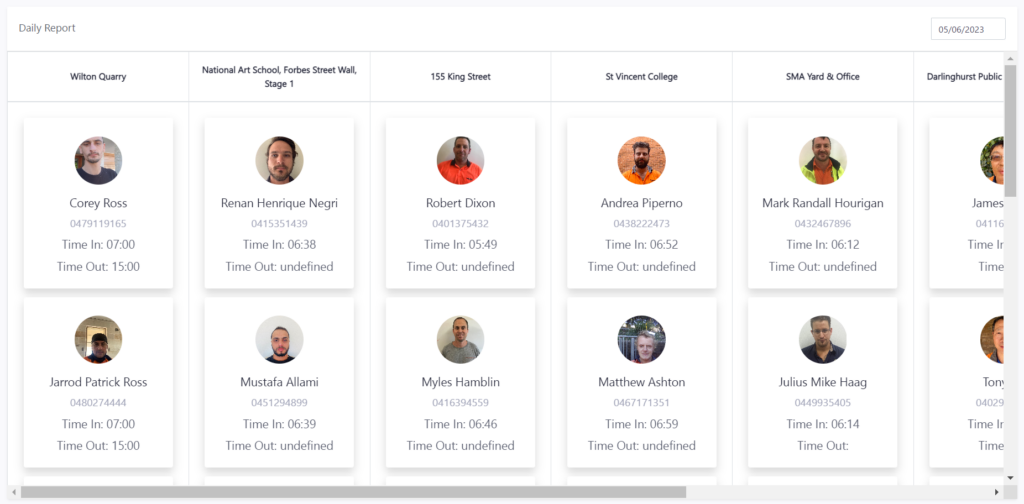
Beyond the upgrades mentioned earlier, there’s one more crucial feature to highlight on your portfolio dashboard: the ‘Daily Report’ section. This section provides a real-time snapshot of your daily workforce operations.
The ‘Daily Report’ lays out key information including your workers’ location, start times, and when they finished their job. This up-to-date data is a great asset for managers coordinating multiple projects concurrently. Having immediate access to where the workforce is engaged in, and their respective time logs can contribute to smoother and more efficient operations.
This real-time information also empowers you to better manage resources, enhance planning, and swiftly respond to any arising workforce issues. We trust that this level of transparency can drive improved productivity and foster a better working environment.
Quick Insights from 3 Pie Charts

To conclude, we’ve enhanced the existing pie charts on the portfolio dashboard. The first chart makes it easier to see income-generating active projects, while the second helps you identify high-expense active projects. The third provides a clear count of draft and accepted quotations.
These updated charts aim to provide you with visual, at-a-glance insights into your portfolio’s health. They’re designed to help you make data-driven decisions and enhance your portfolio’s performance.
Thank you for using PVManager. We’re excited about what’s coming next, and we hope you are too!


